For me this was the hardest lab that we have done so far as a class, although that is most likely due to me not being in class on Thursday and attempting to pick up what was going on several steps into the process. I’ll discuss my general feelings with the project later on, but for right now it is best to address my one main issue with this. When I try to access my project, or for that matter anyone’s projects, on the ArcGIS website, it gives me a link like this:
https://carleton.maps.arcgis.com/apps/instant/media/index.html?appid=3cbd4d2ce36b4c818fd3b462883e9765
Now, this is simply a bad link, taking me or anyone else to a blank white screen, leaving me unable to embed my project and show it off. As I do not know how to correct this problem, I am simply going to drop in a screenshot of what our final project looks like.
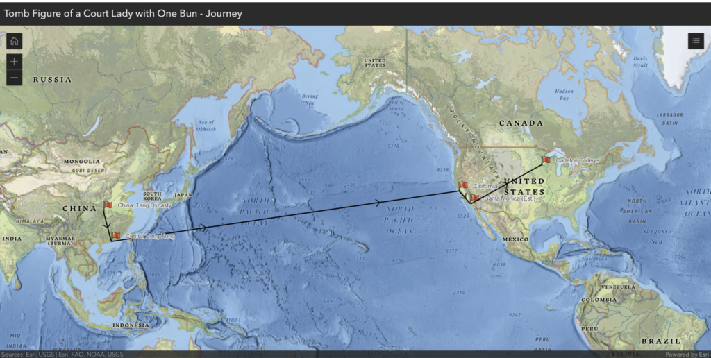
It was an interesting project to sit down and try to map, although one of the challenges was that there was not too much information on exactly where each of its stops were when we sat down to map them. We knew it came from somewhere in China, then was sold in Hong Kong, then imported to California before eventually making its way to the Weitz. The specifics were largely up in the air both time-wise and where exactly it stayed in California. We ended up choosing that it would arrive in San Francisco due to its importance as a port city, and after attempting to look up Laura Larson we found that she was maybe from Santa Monica, which is what our fourth point represents. For the timeline, we had similar problems, as we knew it was imported somewhere before 2020 and was sold in Hong Kong in 1998, but other than that we had no information on those dates, so we just chose to put the data of importation somewhere between those two dates. We also had a little trouble getting the lines between some of the points to work, as they for some reason wanted to orbit the planet, even if we were just going between Santa Monica and Northfield. Our last problem was that we could not figure out how to change the notation of individual points, because we wanted to turn the red flag in Northfield into a checkered flag to represent its finish line in its journey for now.
All in all while this was a confusing lab assignment for me, I can certainly see where a project like this could go, as it would very interesting to see the provenance of much more well known objects, and some of the possible other options for maps on ArcGIS showed a wide variety of things that we could map but just weren’t right for our project. There is certainly a large amount of interactivity that is possible that our limited data and time did not allow us to experiment with.