For lab this week, we were tasked with presenting data in a visual manner. The dataset we were given was the top 10 baby names in New Zealand from 2001 to 2010. To accomplish this task, I turned to Rawgraphs.io as my tool to present the data in an accessible manner.
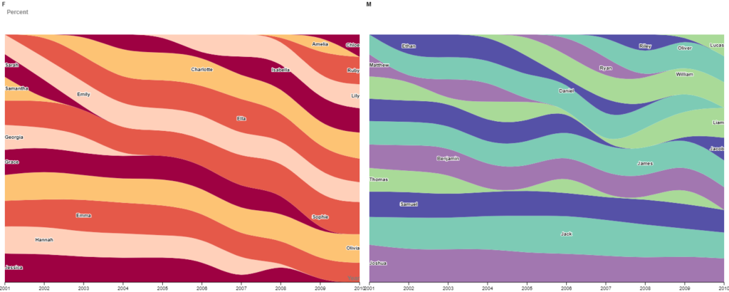
I chose to represent the baby names as a percentage of the top 10 for each year. I thought that this would allow for easy visualization of the pattern over time of name popularity, but in order to do this, I first had to edit the data in Excel and calculate percentages. Following one name through the years allows viewers of the graph to see how the popularity (as represented by the percentage of top 10 names) of the name has fluctuated or not.
The default settings on Rawgraphs.io however were insufficient for my data visualization needs. In particular, the colors automatically assigned to each stream were nearly identical to their neighbors which severely impeded the legibility of the graph. By manually switching to an alternating pattern, my goal was to create contrast and legibility much like a map might. In addition, by choosing two different color palettes for the two sexes, I was able to create a visual distinction there as well.
While working on this project, I reflected on one reading we did for class in particular: Catherine D’Ignazio and Lauren Klein‘s What Gets Counted Counts. The connection most apparent to me was their discussion on the role of data in enforcing binaries and, in this case, the gender and sex binary. Sex and gender are NOT binaries but presenting data as above, divided into a strict male vs. female, enforces the perception that they are. The problem is, data for non-binary and intersex individuals don’t exist in the same volume. That is to say, they often aren’t counted.
Presenting data in an accessible and easily understandable way is a core tenet of the Digital Humanities, but sometimes that can come with costs. For example, in the graph I created above, I made the decision to separate names by sex at birth in order to make the data more legible. However, in doing so, I imply both a binary of sex as well as enforce norms for gendered names. The balance is perhaps difficult to find, but I think that is important to reflect on the systems of oppression we uphold, even implicitly, in the way that we communicate as Digital Humanists.
This is such a great post! Your data visualizations look awesome, and I love the colors. Your thoughts on the dataset reinforcing the gender binary really resonated with me. I was thinking about the same thing while I was analyzing my data, and I think you bring up an important point that as digital humanists, we must inspect our own internalized tendencies towards oppression as we are working on our projects to make sure they don’t bleed into our work.
Firstly, I love the pastel colors as they really make for a pretty visualization. Secondly, I think your decision to represent the data through percentages of the total top ten count represent the data in a very clear unique way. You can easily observe the ebbs and flows of name choice throughout time while comparing popularity relative to others. I also appreciated your reflection when separating the data by the names associated with sex.