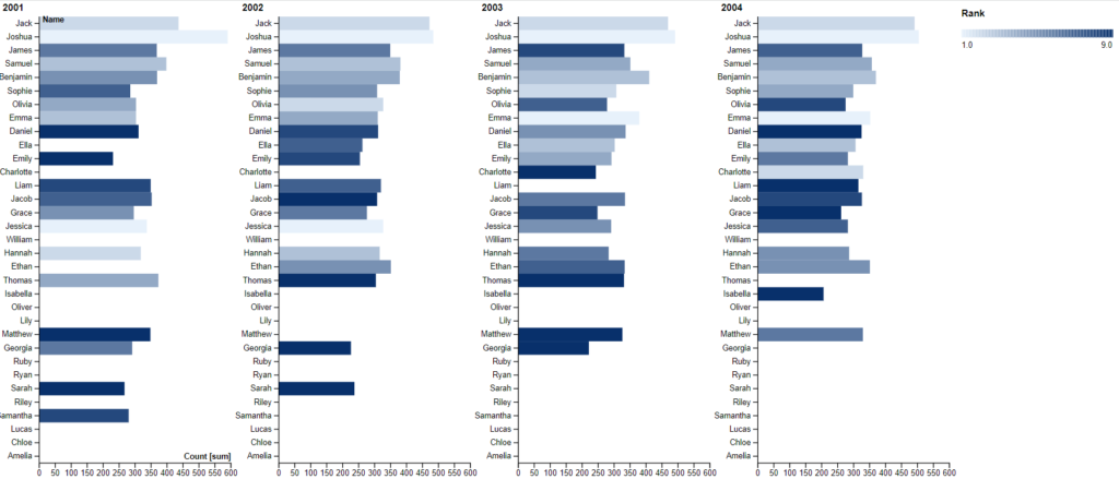
I used Rawgraphs.io to visual this dataset of the 10 most popular baby names in New Zealand from 2001-2010. I selected to use this horizontal bar graph as I felt it was easy to see the different counts of each baby name separated by year. The image above only shows the years 2001-2004 as there were too many years in the dataset to fit on one screen. Also using the legend, you can determine where that name ranked in that year in terms of how popular it was (ranking from 1 to 9, 10th ranking was not included when parsing data for some odd reason). One part of the graph that I changed to help with the clarity of the visual was as previously mentioned making this a horizontal bar graph versus a vertical bar graph. I found that with the vertical bar graph, the x-axis that contained all the baby names was being crammed and overlayed with each other. I was struggling to find a balance between fitting the names all spaced nicely on the x-axis and having the visual an optimal width to view the data. So, I opted with changing the graph to a horizontal bar graph which I thought was a lot better.
Reflecting on Lin’s, after creating the graph visual, I spent a good amount of time looking at how this graph could look better visually so the reader has to spend less time thinking about the visual and more time thinking about the data. Some things I would definitely change about this graph would be getting rid of any zero values for each year, which I was not able to figure out how to do using rawgraphs.io. The graph uses all names in the dataset for each year even if it was not in the top ten names for that year and I think if we could ignore those null values in the graph, it would be a lot more clear and visually appealing. Another part that I noted was the in making separate graphs for the years, I also would have liked to split the data up by year and gender (for example: 2001 Male and 2001 Female). I think this would also help to be able to compare names within the genders. But as a work around I added the color to be determined by their rank so you could at least have an idea where that name ranked for that year in the gender.
Hey Doug, great figure! I agree that the visualization aspect of data is extremely important to get your point across to a viewer. I really liked how you flipped the coordinates to make the data easier to follow. I also appreciated how you split the graph into four, makes it so much easier to follow. I think a different program like R would be useful in getting rid of null values in your figure. Overall, great work!