I chose to use a beeswarm plot to visualize the changing rankings of names over time, regardless of gender. This style of plot is ideal for displaying all the names on the y-axis and the years on the x-axis, as well as the rank of each name in each year. Additionally, the size of each bubble corresponds to the count of each name, providing an easy way to see which names were most popular in any given year.
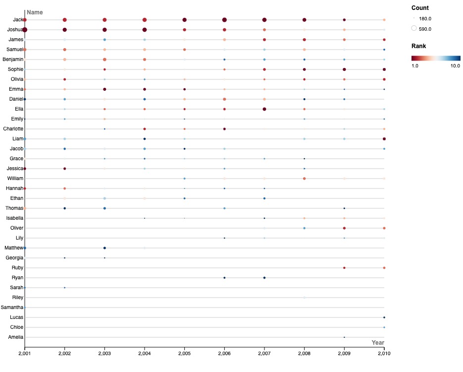
I had to make several adjustments to my graph, including changing the x-axis between “rank” and “year”, and deciding whether to organize the y-axis in ascending or descending order. In DH, it’s important to create a project that contributes to research while also sparking new questions. Lin’s lecture emphasized the importance of creating clean, simple, and informative visualizations.
To do this, I had to think carefully about what information I wanted to convey and what questions I hoped to raise. Instead of separating the graph by “gender“, I wanted to encourage viewers to consider the top five names, all of which were men. To make the visualization more approachable, I chose to use “year” instead of “rank” , as it looked cleaner and was easier for viewers to understand. I also took Lin’s advice on choosing colors that would help viewers see general trends.
Overall, my goal was to create a visualization that would prompt thoughtful analysis and further investigation.