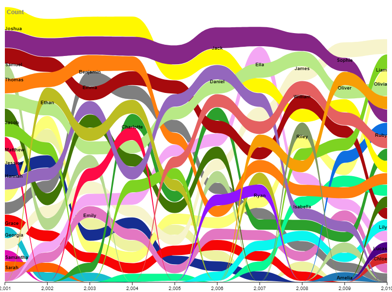
For a long time, I think I really took for granted how hard it is to visualize large amounts of data. The Excel sheet that we were given has just over 200 names, and there is a lot to consider when trying to visualize this amount of data. The first thing I wanted to consider is how to make the data look good. Aesthetically, I wanted it to be something that I found fun rather than difficult to understand. I’m not sure how successful I was in achieving this goal (it’s probably more personal preference), but I think at the very least, my graph looks fun. The next thing that I wanted to consider is how understandable the data was, and for the most part, I think it’s pretty understandable. I wasn’t sure if omitting some of the data that we were given was an option, so I kept all of it, which is part of the reason there is so much going on. One thing that I would change is how much data is in the Excel sheet. Although the visual looks busy, it’s not too hard or impossible to track the trends of each of the names, and it is really helpful to be able to compare the name’s popularity and see when they were most and least popular. I’m open to suggestions, but for my first time trying this, I’m pretty proud.