I chose to visualize how the popularity of each baby name changed over time. To do this, I chose to create a bee swarm chart, which shows the distribution of certain groups over a continuous dimension. In this case, it shows the distribution of baby names over the years, with the dot sizes representing the count of each name for that year. As the title of the data entails (“10 Most Popular Baby Names in NZ”), the focus of the data is to show the most popular baby names for each year from 2001 to 2010, and this bee swarm chart allows the viewer to easily visualize which names are most popular for each year, as well as how each individual name popularity changed over time.
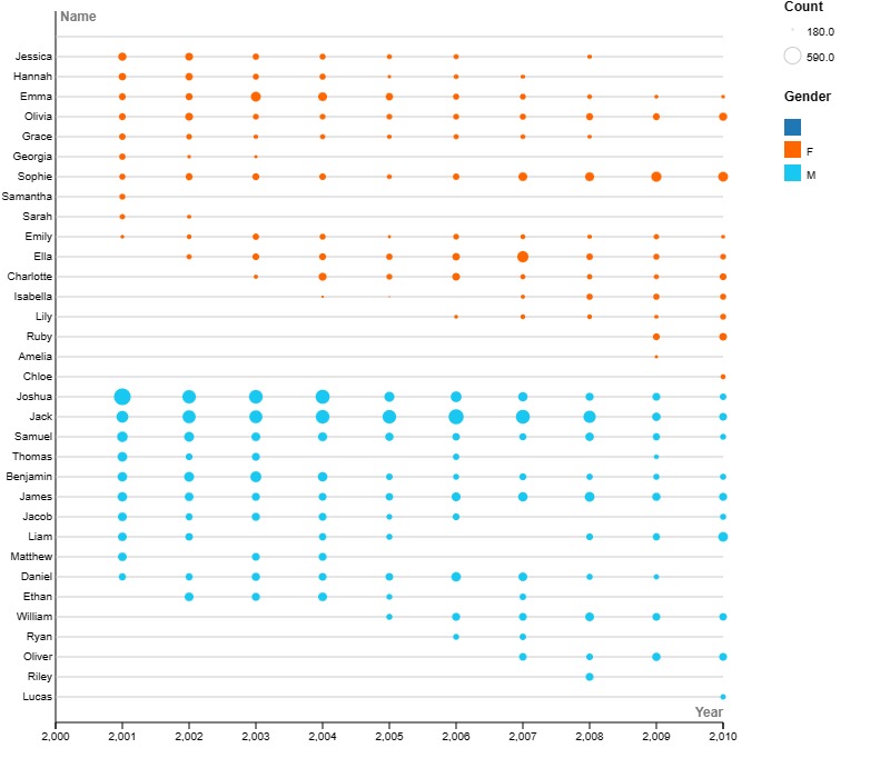
I did a couple of things to improve the quality of my bee swarm chart, which was generated using Rawgraphs.io. One of the first issues I encountered was that the dots for 2001 were plotted straight on the Y axis and covered up some of the name labels on the Y axis. To fix this, I added an extra case with year 2,000, with an empty name, gender, rank and count. This action shoves the first year of the data, 2001, to the right so it doesn’t cover the labels. In account of this, it should be noted that the popularity for each baby name in 2000 is not 0; it is simply not accounted for in this dataset.
I also altered the width/height of the chart, as well as the size of each bee swarm dot, so it is easier for the user to view each dot. The default setting had the dots very close together, making it hard to see the lines that connected the dots to the name labels on the Y axis.
Data visualization in the digital humanities is all about creating a representation of data that the average person can derive meaning from and can easily visualize data that would be too hard to comprehend in its raw form. This visualization takes the main cornerstone of the dataset, the count of each baby name per year, and refocuses it in a way that explicitly shows the correlations and change over time in this specific data.
That’s such an interesting graph, I’ve never heard of a bee swarm plot! I also like how you added the empty year at the beginning for better readability, I thought that was a clever touch. Although it can be a bit difficult to distinguish the area of different circles compared to one another, I thought this was a neat way to visualize the data in a clean looking format.
I really like your visualization! I think that the bee swarm plot is very effective for visualizing this sort of macro change over time. If comparing more specific names, I think the circles could get a little confusing to compare, but on this more removed scale the trends are easy to recognize! Your changes also worked very well for increasing aesthetics and comprehensibility!
I wish I thought of this graph because it is very unique. I think, regarding the circles, that it would be difficult to judge the ranking in popularity of the names. For my visualization, there was an option for a popup when you hovered your mouse over an observation. This could help with comparisons. Otherwise, I really like the visual and I think the edits you made were smart.