Introduction
The Rhythm of Food is a collaboration between Google News Lab and Truth & Beauty, which explores the hidden patterns of food and drinks word in Google search trend data over the past 15 years and uses GIFs of delicate year clocks to display them. In addition to barely showing the data, this project also adds notations explaining why the specific word was search more frequently during a certain period of time.
The Black Box
Sources
Data analyzed by The Rhythm of Food all comes from Google Trends in the form of search results. In addition to the data, Google Knowledge Graph topics is also used to distinguish the derived meaning of food-related words from their original meaning (e.g. “Apple computers” from the fruit) and to focus on data from the United States.
Processes
The Rhythm of Food analyzed hundreds of ingredients, recipes, and other food related search terms, covering topics of food from FooDB. It pays attention to many facets of food seasonality, as analyzing search interest of food in the United States over the last 15 years.
Presentation
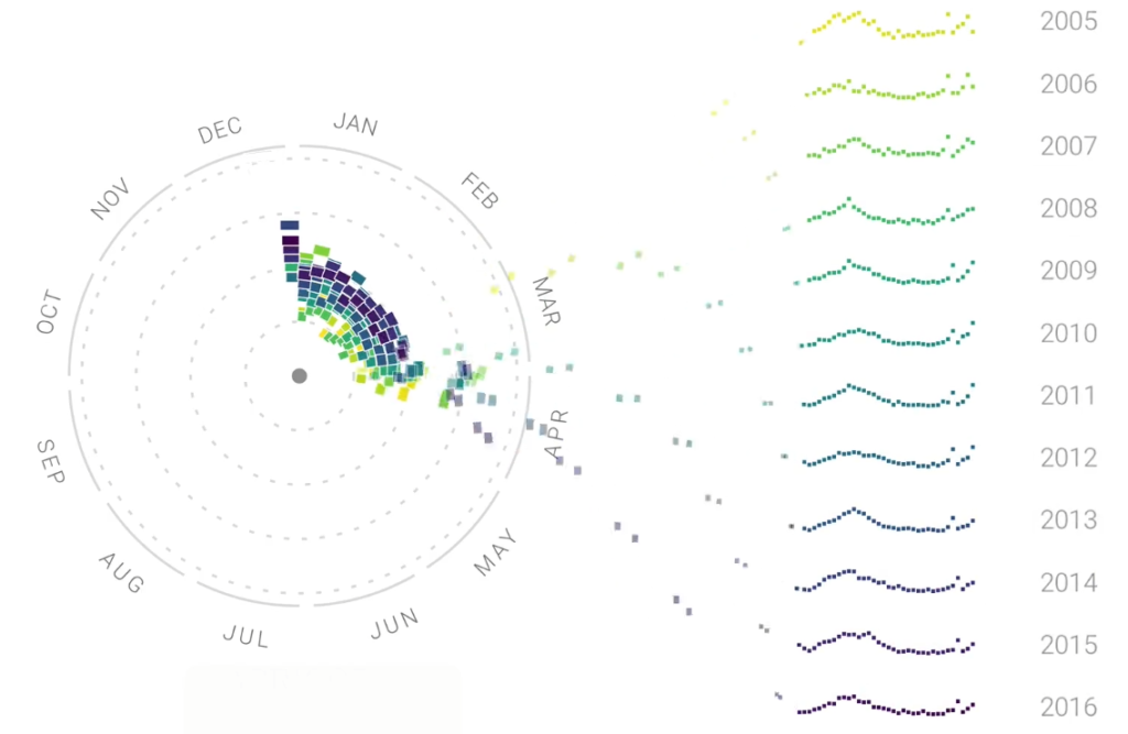
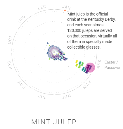
The Rhythm of Food uses specially designed year clocks to present the search data, with directions of the clocks indicating the months, colors of the data points indicating the year, and radii of the data points indicating the frequency of searching. The project provides a GIF showing how each year clock is made; otherwise, it is possible that many data points overlap each other. Also, the project creates explanation for the reason why a word can be searched more frequently during a certain period of time.
A new question I have
Other than the trend over the months yearly, I also noticed the line charts provided along with the year clocks. There were an increasing searching trend of most food and drinks over years. Therefore, I wonder whether the trends score is based on the portion of searching or the total amount of searching since there was definitely an increasing trend of using internet from 2005 to 2016. Also, there was a little problem with the website that I discovered: the link to Google Knowledge Graph seems to bring the browser to another website where you can download Google Search instead of the original URL there.
Discussion Questions
Is the project open source/ open access?
Yes, of course. The source of this project, Google Trends, is open source itself.
Who is the target audience?
Everyone who is interested in patterns of food seasonality can be the target audience. You do not need professional knowledge to understand the year clocks and the data. They are pretty understandable.
