
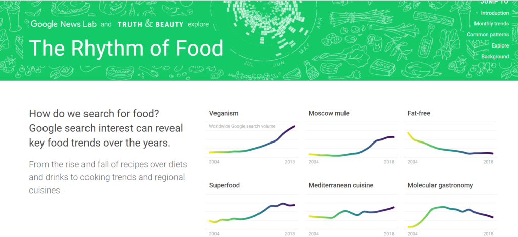
The DH project I chose to analyze for this lab was entitled ‘Rythm of food’. This project provides findings on the patterns of google searches of trending foods. It only provides visual data in the form of charts showing how frequently certain food searches are throughout the year and across many different years.
Sources
This project utilizes data from Google trends. They partnered with Google News Lab and collected data on how frequently certain keywords that relate to a food trend are searched throughout the year. They have collected 155, 000 data points on 201 different topics.
Processes
After collecting their data they created charts that arrange the data visually. They collected data on all associated terms together and compared the frequency of the searched term through different months of the year for multiple years.
Presentation
The data is displayed in circular charts, where each color is a different year and the circle is divided into different sections and each different subsection of that ring represents the months of that year. Therefore, months that have an increased frequency of searches will have a greater radius in a subdivision of the ring. This shows which trend is searched more in a particular part of the year.
In class Questions
What is the goal of the project?
Which academic fields (i.e history) do you see the project in conversation with?
Though this Dh project does not have a clear research goal, one main outcome is they have a lot of patterns with trending food searches and seasonal availability of foods, or traditions/events. As stated this project does not state a goal, but the data collected can be used for further projects. These projects can be in many fields but mainly Sociology or Biology.
I also analyzed the Rhythm of Food project. I like your sectioning of information in your lab post. One thing that I would appreciate if I was a reader unfamiliar with this project is a link to the project website and some images of the data visualization graphs on the site. Otherwise, I thought you did a really good job explaining the project. For my analysis, I thought that the goal of the project could be for businesses that sell produce, however it seems the project currently is just open to the public.