The Site
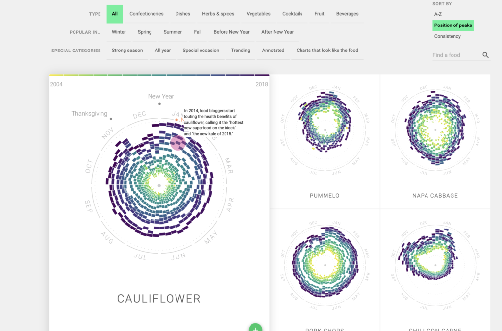
The Rhythm of Food Analysis is an online data visualization site that analyzes Google search data and plots how often certain food or diet terms are searched on Google over time. How frequently a particular word or term was searched, such as “veganism,” “fruit salad,” and “quinoa” is plotted on a circular graph with 12 different sections, one for each month, and different colored blocks to represent a year between 2004 and 2018. Farther out on the circle means that the term was searched more often in that particular month on that particular year.

These data are organized and presented this way to make yearly or seasonal trends easily visible. In this example, “blueberry” is searched more frequently around the end of June until the beginning of August.
The Data
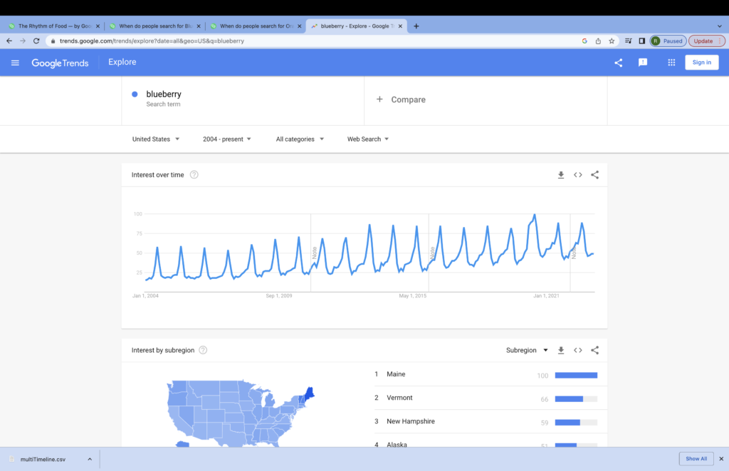
The data for this site were collected from Google Trends, which is Google’s official archive for their publicly available search data. This archive is able to display search frequency data from 2004 to the present and from anywhere in the world in a line graph.
The Process
Because the information for this site was pulled from another online source, I don’t think there was any digitization required. The data were also already graphed for search rates over time, so I also don’t think there was any additional analysis there. However, the graphs are organized so that they can be sorted and filtered in a lot of different ways, such as which graphs have the highest relative search rates each month. Also, many of the graphs have annotations that note specific times of year or reasons that the term might be searched a lot at a specific time. For example, according to the graph for “strawberry,” the frequency that strawberries are searched for in Google spikes around February before decreasing for the next few months. There’s an annotation on the side that notes that Valentine’s Day is in February, and people are probably looking for chocolate-covered strawberries because of it.
The Presentation
Unlike the raw Google Trends data, the graphs in The Rhythm of Food are presented in clock-like circles with the months around the edges and years as different colors. To be honest, I was confused the first time I looked at the site, but there is an introduction and an animation showing how the data are graphed at the top of the page. Scrolling down, there are filters for type of terms like dishes or vegetables, when they’re popular, and some special categories like strong seasonality or terms that trend toward special occasions. When you apply filters, the circular graphs for the terms that fit the filters show up in a list you can scroll through.
Further Thoughts and Questions
I think this site is clearly targeted toward the general public because of its colorful presentation and in-your-face introduction that holds your hand through the initially confusing data. Its goal is just presenting interesting search data, as the site doesn’t seem to make an argument. Some of the annotations explain why people look for certain terms at certain times, but I wouldn’t consider those “arguments” per se.
Something interesting about the data that I didn’t notice until I went to see where the data comes from is that only data from the United States is used, so I’d be interested to see how these graphs would change if we looked at search results from other countries. Cultures around the world eat different foods and celebrate different holidays, so I have no doubt in my mind that the graphs would look very different.
This is a great deep look at this project. When I tried visiting the site, I was unable to get Google Trends to open properly, which was frustrating, but I appreciate that you took the time to take a deeper look at it. I hadn’t considered the implications of opening the service up to foreign countries, but it does make me wonder, with all of the variation in food availability in the world (not to mention technological availability), would you end up with region-identifiable searches? In any case, good job, Rowen!
Just like A.J, I really appreciate your thoroughness in the explanation, as well as how well it was organized. This is a really interesting project, and I’m thankful you went into depth about how they got their data, since I couldn’t get it to open either. My main question about this project is that I wonder what uses there is for this kind of data collection in the day to day world. I was thinking that companies could use it to see when to market certain products, but I wonder if there are any others. Great job Rowan!
Very well detailed analysis! I agree that the target audience is more than likely the general public because of the “hold my hand” walkthrough. The project does seem to just be a fun presentation of interesting data. Will mentioned in his comment that companies could use the project to get an idea of when to market certain foods which is a very interesting point I hadn’t thought of. Companies could probably use the data to upscale their sales.