Like the title suggests, I chose to analyze the Google Labs, Rhythm of Food. Although the title of the project does not have any direct correlation to music, the visualizations do have a rhythmic quality through their peaks and with years of data. What are the components? The site is organized into several related categories of food searches like: popular foods in your current month (currently displaying popular foods in January), followed by examples of common seasonal patterns, and many more interesting searches. At the beginning of the site, they describe how they represent Google trends data on a year clock. Upon analyzing this site, I was wondering what inspired the clock design to represent their data? There are many other ways to represent data through the passage of time (ie. a line graph), but I would argue this does a far better job. Based on my exposure to data visualization, this seems like a unique design choice.
Sources
Who made the website? The Rhythm of Food project was created through the collaboration of Google News Lab and Truth & Beauty. The goal of Google NL is to work with entrepreneurs and journalists to fight misinformation, while T&B aims to visualize meaningful data. What type of Data was used? They analyzed hundreds of ingredients, recipes, and other foody search terms. All the data comes from Google Trends data based on past Google searches.
Process
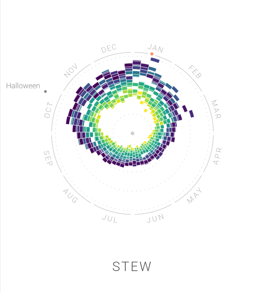
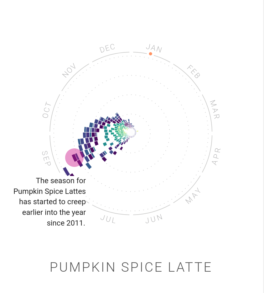
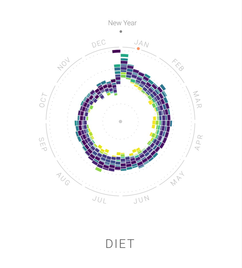
Based on the quantity of searches of certain food related vocab, they are able to create a visualization of the monthly to yearly popularity of said item. The yearly clock is able to represent the data in a different medium than a standard line graph. Each year is color coded, so you are visually able to differentiate between yearly trends, and larger the radius of a colored block (the distance from the dot in the middle), the higher the frequency of searches for that item during that particular month.
Presentation
I think what stands out to most people (including me), is how visually appealing this project is. There are many factors that make this data enjoyable to look at: the color scheme of the website and the different years are complementary (hues of blues, greens, and purples), the circular medium for the data easily allows you to see the difference in trends between years, and the distance from the center creates the rhythmic nature of the data. Despite being aesthetically pleasing, the graphics efficiently display their data to their observer. For instance, it’s easy to see that stew is more popular during the colder, winter months from October to January while it steadily decreases in the summer months. Moreover, Pumpkin Spice violently spikes in popularity in the fall because it is renown for being a seasonally fall trend, albeit a bad one. We can also observe the trend data creeping further towards the end of the summer, which is unacceptable in my eyes.