The project I looked at explored the yearly trends in google food-related searches over time. This project was created through a collaboration between Google News Lab and Truth & Beauty.
Here’s a link to the project: https://rhythm-of-food.net/
Source
Sourcing was a little simpler for this project compared to others. All the data is acquired through Google Trends search data. However, a couple of things are needed to clean data to make it relevant to the project. Firstly, Google Knowledge Graphs were used to select searches that were of interest. For example, apple the fruit versus Apple the tech company. Also, to fully understand which terms would be relevant to the project in the first place, FooDB was used to find food related search terms.
Process
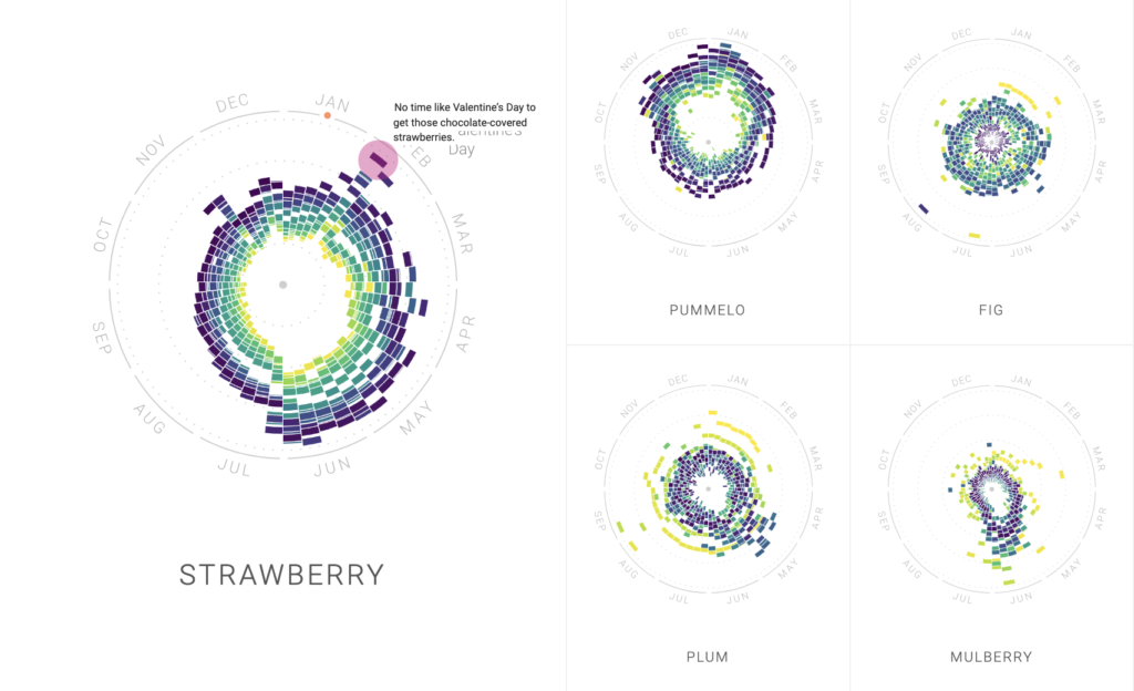
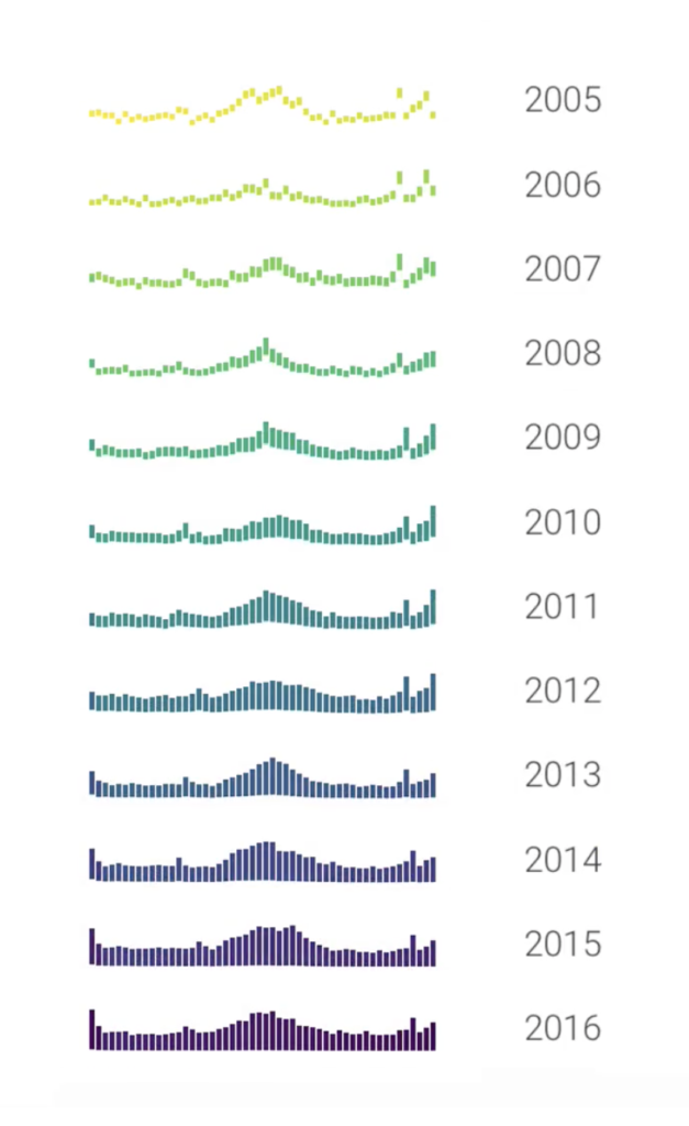
The process for this project was not too complicated. Data for the frequency of mentions for each food-related item were recorded over a period of 15 years. Measurements of the frequency of mentions were taken 4 times per month. Following this, a clever circular plot overlays all 15 years of data to create a great way to visualize the data of interest. A great demonstration of this process can be seen here: https://rhythm-of-food.net/#food-trends. Here are some images of the process.
Presentation
There is only one form of presentation for this project. However, there are some features that enhance the presentation. There are options to sort the data or search for specific food items of interest for the user to look at what strikes their fancy (shown below). For example, one of the sort options is by month. By clicking a month of interest, you get food items that peak for the selected month. Likewise, seasons, holidays, food categories, etc. are also possible sort options.

In Conclusion
Based on the limited background information provided on the site, the project seems to be for the general public. There are many possible uses for this project. Businesses can figure out when to sell a product of theirs to increase their revenue. Also, this technique can be applied to non-food commodities too for business informatics. I found this project very interesting and the visuals are a very cool way to depict yearly trends. I’m left wondering if there are more ways to use this type of data visualization.
I definitely agree that the target audience of this project would be the general public but also from a business perspective and how it could also increase sales. I also saw that this project would be useful for restaurants in knowing what types of foods or dishes are popular at given times. For example, making more turkey dishes around thanksgiving could prove to be more popular and increase revenue.
I also focused on this DH project and I will also agree that due to the limited availability of background information but also it seems as if a great deal of effort was placed into how the findings were presented, this project appealed to a general audience. I also like how many different food searches there are data on.
I really like that you split your blog into different sections with titles so that readers can easily tell what each paragraph is about. I also analyzed this project, and I definitely agree with you that there are many possible uses for this project. For example, it mentions that New Year’s resolutions lead to a peak in searching the term “diet”, which can be related to psychology and sociology.
I also focused on the Rhythm of Food project and agree what you have explored. It is a project with pretty clear purpose and presentation. I like the way you use screenshot between lines of paragraphs. That makes relevant information visible and vivid.
I like how you managed to present the data/graphs from the DH project clearly enough so that we can see it. But you could have been more clear with the data source, for example most people don’t know how google trends are translated into numerical data. In general you did really well and made me want to try out this project.