In this tutorial, I will describe how you can make a bar chart race using the website Flourish. This tool allows you to turn a static bar graph into a more interactive visualization that changes over time, as long as the data you have includes some sort of sequential time variable (such as yearly increments). This tool is very useful for work in Digital Arts and Humanities because it provides a powerful tool for visualizing and analyzing large datasets quickly. Additionally, the use of a bar chart race can show how volatile or stagnant a variable is year to year, which is something stagnant line graphs or bar charts can’t do as strongly.
Walkthrough
Step 1: Data cleaning
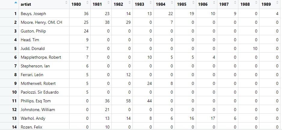
To begin with creating a bar chart race, you need to ensure that the data is in a format that is suitable for a bar chart race. For the bar chart race to work, you need a separate column for each time increment; for example, I needed to have 10 columns, each with a different year for the gallery. I also needed each artist to be in only 1 row. In order to format my data into the correct format, I used the tools RStudio and OpenRefine to clean the data. Within R, a powerful tool I used was the dplyr and stringr packages; if you are unfamiliar with these tools, this overview of stringr and this dplyr tutorial could prove to be very beneficial. Using these tools, I transformed the dataset into one that removed extraneous variables and filtered the artists to only include those that were in the top 10 for one of the years. This is the hardest part of the process, so don’t feel discouraged if this is challenging!

Step 2: Uploading dataset to Flourish
The next step was to upload the dataset to Flourish. Go to the website for Flourish, and log in or create an account. From here, click on new visualization, and scroll down in the templates until you reach the section “Bar chart race”. Click on the first option.

From here, click on the data tab, then there should be a blue button in the upper right to upload data. You can upload your dataset here.
Step 3: Choosing variables to represent
The next step is to choose the appropriate variables for Flourish to create the bar chart race from. On the right hand side of the page, you can type in the column IDs for the label (the column for what each bar should be named, which is the artist in my example), the values (the values of each artist for each year, or whatever value is associated for each of your time increments), as well optional categories for coloring your bars and adding images. This is what this page looks like (note that I later made column A a category as well to color each bar):

Step 4: Customizing visual details
The next step is to customize details of your bar chart race. This is done under the preview tab. I found that most of the details were already how I wanted them to be; however, two things that I changed from the default settings were to disable the legend that showed which artist was associated with each color, as well as changing the labels since the names of artists were getting cut off. Removing the legend was done under the legend tab on the right, and changing the label was changing the spacing under the label tab on the right. Here’s what the preview tab looks like:

Step 5: Embedding your bar chart race
With your final details cleaned out now, you can publish your bar chart to embed onto a website if you so desire. You can now click on the black “Export & Publish” button in the top right, click “Publish to share and embed”, then “Publish”. Once published, a drop-down in the top right will give you the option to copy either a link to your bar chart race, or some HTML code under “Embed on your website”. Copy the HTML code, and this can be pasted onto your website! This is what this looks like on Flourish:

If you are also using WordPress, you can embed this by adding a “Custom HTML” block, and pasting in the code. You should now have an embed of your bar chart race on your website!
If you are still struggling, hopefully this YouTube tutorial could help clear up some more of the details. I hope this tutorial was helpful!
I have seen this kind of bar chart race comparing different data, such as number of fans of vloggers, gross product of certain industries, etc., since childhood and been interested in them for long. Thank you for sharing the way to create such charts!
Your tutorial is amazing. I’ve seen countless times of such videos and graphs, but I never expected the way of actually creating a bar chart race to be so simple and elegant. I am just curious if there is a way to omit the “total” count at the bottom right corner, which seems unnecessary. Overall, thank you for the post!
Yea I also thought that making these bar chart races would be kind of difficult. I thought you might have to animate the bars all by yourself or set the positions of the bars manually for each year/time period, and so on. Turns out, it’s a lot simpler than I thought, even if the data you use needs to be formatted a specific way (as our final project group discovered). Thanks for the tutorial!
I always found bar chart races to be one of the coolest data visualizations I’ve seen in this class, but it seemed a little daunting to make until I read this tutorial! Your instructions are super clear, and I’m thankful you included another video tutorial at the end, it shows you are about the person readding the tutorial and in case your instructions didn’t get through to them, you pointed them in the right direction.
I see this type of visualization used a lot to represent data over time. It does not look very simple to make. However, your tutorial really helps guide me through the process and so that I can make a bar chart race visualization myself sometime. I love how thorough the tutorial is and the accompanying images make the tutorial so much more easy to follow. Good job on this post!