
I chose to represent these data in a bar chart using the website RAWGraphs.io. Each bar represents the cumulative count of each name from 2001 to 2010, with blue bars being boys’ names and pink bars being girls’ names. I used this format to display these data because I was curious to see which names were the most popular overall, rather than just year-by-year, and I figured that this was the best way to do it. Using a bar chart in decending order allows you to tell which names are most popular overall at a glance. The color coding also helps visibility, as it allows you to distinguish from girls and boys names very easily, and it’s more interesting to look at, in my opinion. Displaying the dataset this way also leads to some interesting questions, such as why are boys’ names seemingly more popular overall than girls’ names? Does this suggest that more boys were born in New Zealand than girls from 2001-2010?
I originally wanted to organize the dataset in a treemap with the larger rectangles representing more popular names. I thought that would make for a visually interesting way to represent the data, and it would be even easier than a bar chart to tell which are the most popular at a glance. However, I eventually decided against this approach because with the amount of names there are on the list, the map ended up messy and hard to read. I then wanted to make multiple bar charts, one for each year, with the 10 most popular baby names from those years. I also abandoned this because of messiness; I wanted to keep all the data on a single chart. With that said, I think breaking up the years into multiple charts would have allowed you to learn more about the data because in addition to the year-by-year breakdown, you could manually add all the counts of the names to determine which are the most popular overall.
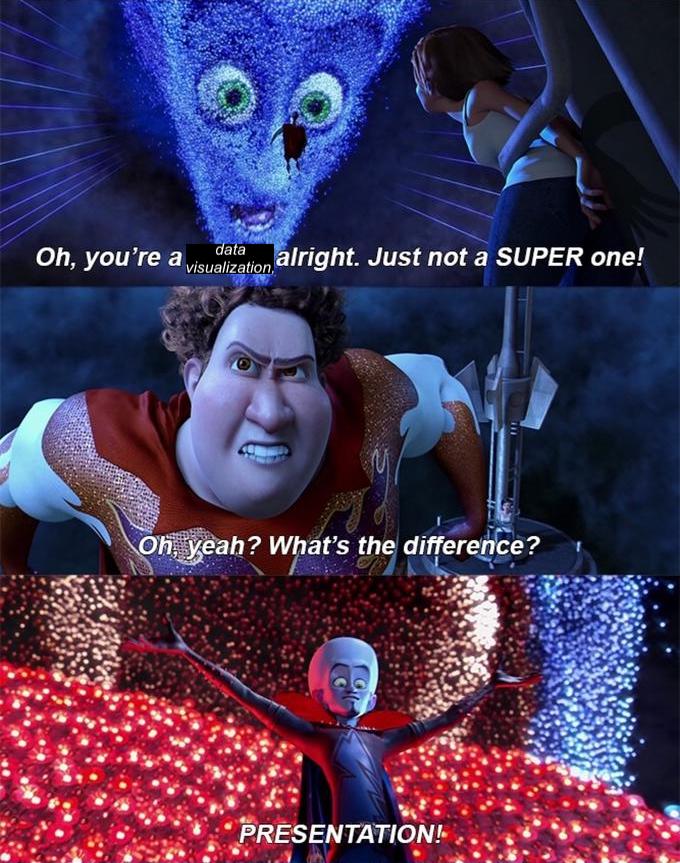
The digital platform means that humanities projects (especially ones with a lot of numbers) can be more than, well, numbers. As Lin talked about in her lecture, how data are presented in a digital humanities project can enhance or destroy its effectiveness. A lot of the techniques she described for presenting data, such as making more important elements larger or grouping related elements together, seem so intuitive that I imagine a typical viewer wouldn’t even think about them. But they’re vitally important for conveying data and failure to adhere to some of these principles can make the project unreadable. Now, I’d like to leave you with a meme relating to this discussion that I spent too much time making.
I agree that splitting the chart into smaller ones based on years would have been very messy, but for your problem with it being a rather wide chart, have you thought about flipping the chart into a horizontal bar chart? I also find your images (including the meme) especially vibrant and good at drawing attentions to them, as well as easily understood. Being able to find (or make) a meme for all occasions might actually be good for understanding, since memes are deeply involved in cultures and carry within them easily recognizable meanings.
I tried reorienting the bar chart, but that made it even harder to read in my opinion. The bars ended up being very narrow and it was somewhat hard to differentiate between them. Also, you’re right, having a meme for any situation is a very useful skill! Though in all seriousness, memes are a decent way to convey an idea, especially because their meaning is often very straightforward.