
For my blog post this week I chose to take a deep dive into Homesteading the Plains, a project by three professors at the University of Nebraska, which looks for networks in homestead states. When initially going through this project, I was very curious how they managed to create these networks. They explain this on their network page, as well as some trivia about the homesteading process. For five weeks, a potential land owner had to put an ad in the newspaper signifying their intention to live on the land, with both a description of the land, as well as four testimonies from current community members.
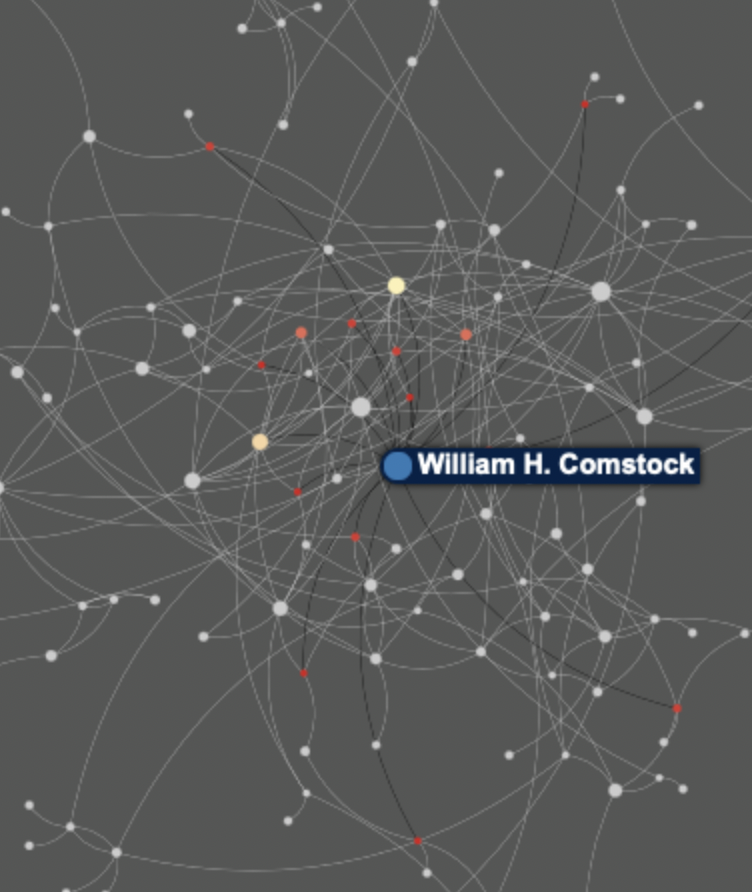
As shown above, this depicts how many people William Comstock “witnessed” in this manner, with the bothered colored dots being the affected individuals, and the black lines, or edges, are those testimonies that he either gave to individuals or was given himself. The professors categorized this data in three separate ways to show the different ways these individuals interacted and how each group formed communities. The first is leadership, which simply shows the importance of certain individuals to communities. The image above shows the “Leadership” graph, which simply shows the importance of certain individuals on the community, with the nodes that are larger and closer to blue showing the number of testimonies given by an individual. This clearly shows how important Comstock was as a community member, but it does not tell the whole story.
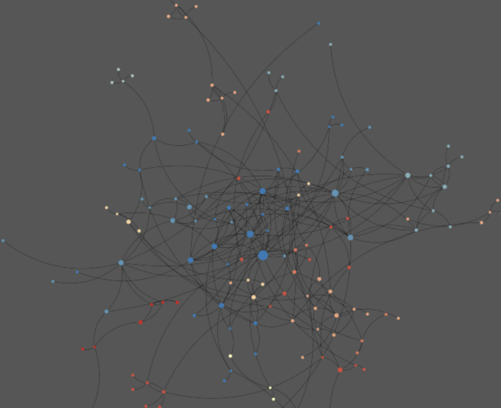
This graph was made through a “community detection algorithm”, and shows the various communities that were made in this specific region. Comstock is still in the middle as the biggest node, but the other nodes now are grouped by color, and show various communities. Even after some research, I do not truly know what this fully means, but this article was useful for me in at least attempting to answer some of my questions.
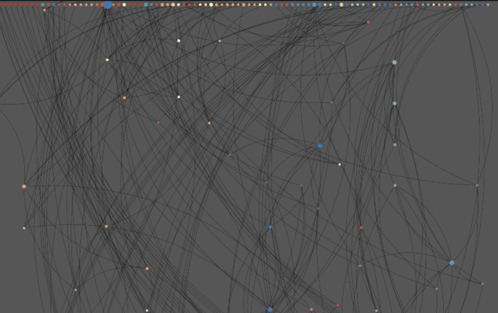
This is the last graph, and the strangest on first sight. This one is graphed based on geography, with those who lived outside of town drifting along at the top of the screen. Comstock can still be differentiated purely based on the size of the node, and this geography “filter” probably implies that he had a lot of land outside of town. They made this graph using historical survey data and the descriptions of land plots from the newspaper ads.
Questions:
While I did enjoy looking over this project, I think there are several things the creators could have done better to make it more accessible. For starters, exploring what a “community detection algorithm” is, as well as better explaining the “Geography” tab, as they claim this graph shows that Western Europeans were more likely to testify for other Western Europeans, which I assume is shown through the color of the node, but it took some thinking to realize this, they have a function to select a color group to show how many connections there are within certain communities, but no names to be able to tell what each group actually is.
All in all, I think the most interesting part of this was the history lesson that came along with it, and showing how these communities grew into what became the towns and cities of today.