Six Degrees of Francis Bacon is an online representation of the believed social network of politicians and influential figures from between the 16th and 17th centuries. Each person is represented by a node, and the edges between them represent a relationship that students and scholars believed they had. The darker edges represent relationships confirmed by the site’s users, and the grey lines represent relationships that are not confirmed but are statistically likely to have existed.
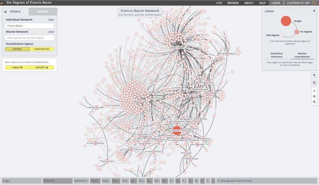
As the site’s name implies, all of these relationships are centered on Francis Bacon, with his node being the largest. The second largest group of nodes are people he directly knew, or his first-degree relationships, and the third largest are people he did not directly know, or his second-degree relationships. Clicking on any of the nodes or edges tells you additional information about the person the node represents or the people the edge connects, respectively. Clicking the buttons in the bar at the bottom allows you to sort people by groups, which can make finding certain people easier. Although if you want to find an particular person, you can enter their name in the search bar at the top left of the screen, and the site will automatically highlight their node and its edges. This feature is very useful because if you were looking for a specific person, trying to mouse over their node in the cluttered web of nodes and edges could be very hard.
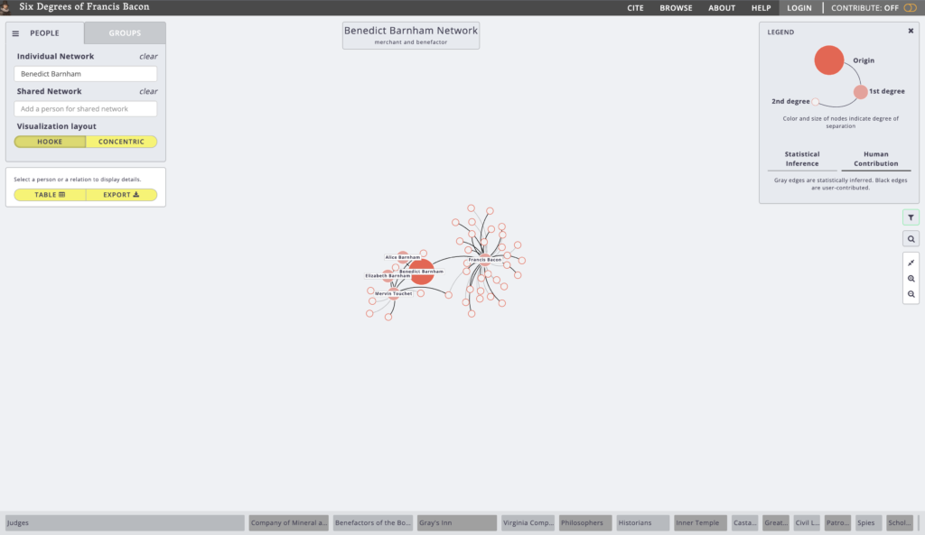
Unlike most of the digital humanities projects I have looked at in class, the data in this site are almost entirely submitted by users. Fortunately, this means that the dataset is always evolving and improving depending on what is discovered. Unfortunately, there is no master location or dataset that I can point to as the place all of these data come from. All of the nodes have links to articles about their person from the Oxford Dictionary of National Biography, as well search results for the person on Google Scholar or JSTOR, but the relationships between people don’t have a single source.
In my mind, this website is a textbook example of network analysis. Each node represents a person, and each line represents a relationship to another person, simple as that. Of course, the definition of “relationship” is debatable, but the site measures relations in degrees of seperation, which is an established way to measure how well people know each other.