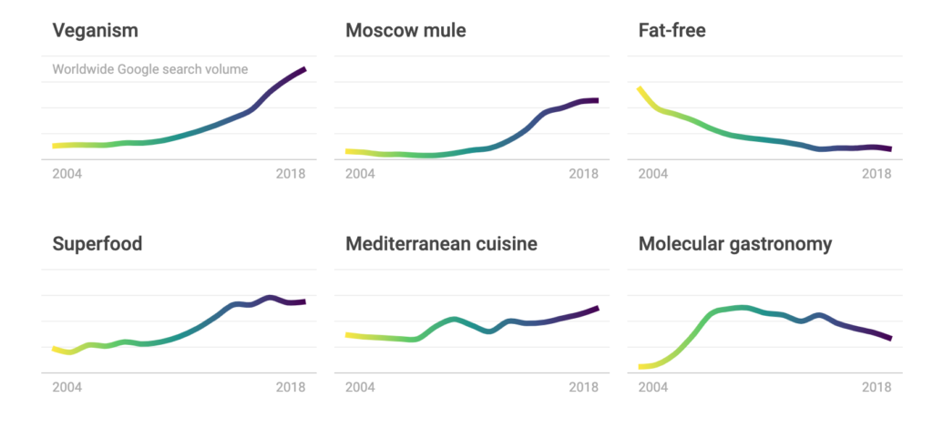
The project I chose to analyze was the Rhythm of Food project. This particular project was a collaboration between Google News Lab and Truth & Beauty that involved collecting Google search trend data over the past 15 years to see what food and drink words were searched on the website and when. Shown in the forms of year clocks, the website displays when and sometimes why these words were searched over the past 15 years.
The Black Box
Sources
The Rhythm of Food project uses data solely from Google Trends in the form of search results. Accompanying this data, the project also used Google Knowledge Graph, to distinguish food-related words from their non-food counterparts (Apple v.s. Apple Computers). They also used this Google Knowledge Graph service to have the data pertain primarily to the United States.
Process
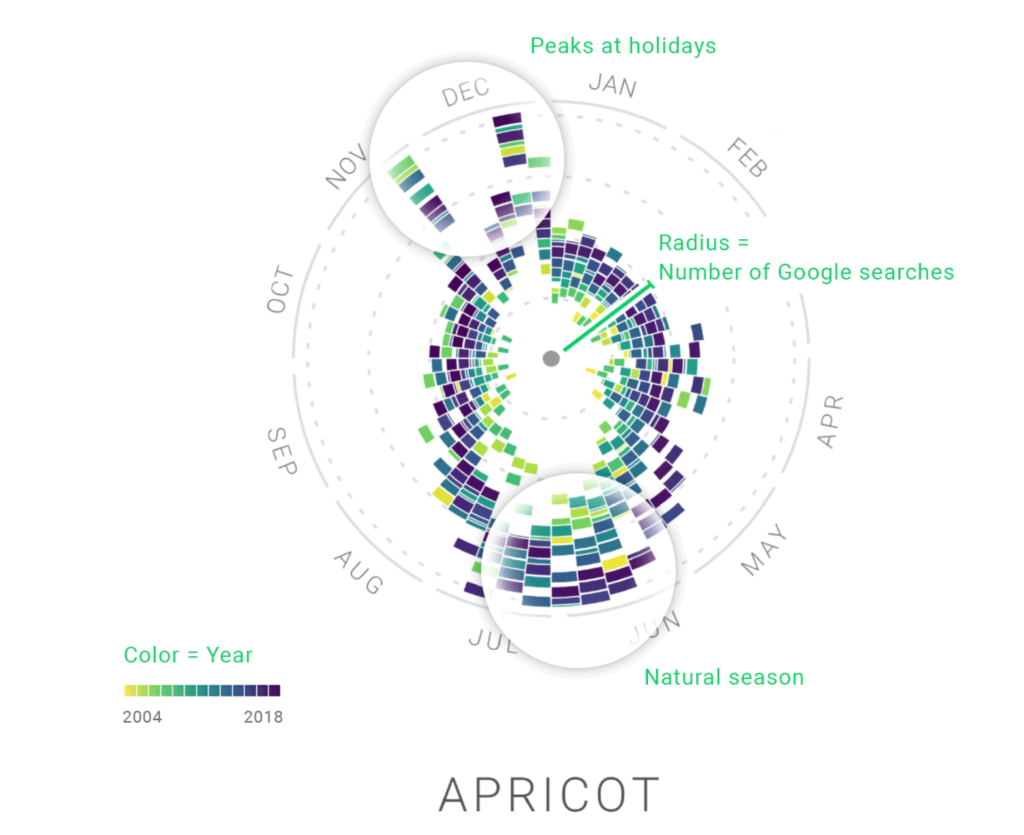
The Rhythm of Food team used solely year clocks to display their findings. Using progressively darker colors to determine the years from 2004 to 2018, they were able to portray which food and drink words were searched for throughout recent years. Also, using informational databases such as FooDB, they were able to explain some outlying trends in the year clocks with comments. For example, explaining that tamales obscurely trend in December due to them being a traditional Christmas meal among Latino families.
Presentation
Along with the colorfulness of the year clocks to indicate the years in which certain food and drink words trended, the Rhythm of Food team added the information that explained trends as comments on the year clocks. For example, a bizarre spike in the search for Shirley Temples in February 2014 is explained by fans of the actress Shirley Temple honoring her after she died. Also, the radius of the year clock circles indicate the number of google searches for the food or drink word, with a wider radius indicating a frequently searched word.
What I’m Wondering
I’m curious if the Rhythm of Food project’s display of public food and drink trends can be extended into the past. Though clearly Google search results wouldn’t be possible if we examined decades into the past, perhaps analyzing and collecting data from old books and cookbooks would be possible. Then, if proper past data was collected, we could analyze which foods and drinks have “died out” or blossomed during recent history.
Discussion Questions
Who made the website? What are their relationships to the institution?
The Rhythm of Food is a collaboration between Truth & Beauty (a data visualization designer company) and Google News Lab. Specifically, Mortiz Stefaner of Truth & Beauty led the creation of the data visualization and design of the displays of the search trends while Simon Rogers and Alberto Cairo of Google News Lab provided much of the food and drink word data. Also, Yuri Vishnevsky helped design the website, Stefanie Weigele provided some of the illustrations, the text and annotation was done by Destry Sibley, and Dominikus Baur provided development support.
What is the goal of the project?
The goal of the project was to take what appeared to be randomly searched food and drink words, and analyze them to reveal hidden patterns. These hidden patterns include when certain words trend by season, which food and drink items have emerged in recent years, and much more. In general, it revealed which food and drink items were popular and when in the United States while also connecting holidays, dishes of complex cuisines, and even celebrities to specific food and drink items.

I personally spent a lot of time browsing through the Rhythm of Food project, so I can understand why you chose to do your lab report on it – it’s such interesting data! I really like your idea of analyzing cookbooks over a long period of time in order to see which recipes have died out or blossomed. That would be a really cool application of using technology to understand sociology and human behavior better. The color coding of the graphs and clocks is so satisfying, too!