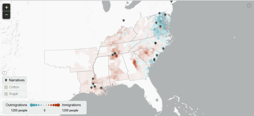
The project I explored is an interactive map depicting migration statistics and routes of approximately 850,000 enslaved African Americans between 1810 and 1860. This created by designers and developers at Stamen Design and funded by the Andrew W. Mellon Foundation.
The project can be found here: American Panorama – Forced migration in the American south (richmond.edu)
Sources
All data used for populations, cotton and sugar came from the National Historical Geographic Information System (NHGIS), which contains reasonable, yet imperfect population approximations and census statistics for each of the decades from 1810-1860. Historian Frederick Bancroft was the generator of this data, assuming that the growth rate of the enslaved population was uniform across the South factoring in higher mortality rates as well as higher fertility rates. Additional growth beyond the projected rates was attributed to slave in-migration, and vice versa for out-migration.
Process
The project designers used two techniques to produce areas in the South that can be easily compared decade to decade. The technique used to create the bubble plot involves combining areas of certain counties to create ‘unions’, then distributing the enslaved population across these new areas proportionally so they can calculate the migration over the decade. The second technique, used to create the map, involves overlaying a ‘honeycomb’ of hexagon shapes over the entire South, then estimating the in/out migrations for each area at a county level. The designers made no effort to account for manumissions (releases) or escapes, as those values were negligible relative to the size of the migration statistics.
The designers also note that the statistics for Louisiana might be inaccurate, as it has been noted from some sources that the mortality rate was higher, and the fertility rate was lower on sugar plantations. The designers used historian Michael Tadman’s growth estimate of 6.5%, but even Tadman mentioned that may be too high.

Presentation
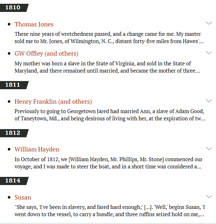
The site has four key presentation elements that are highlighted for the user as they enter: a map containing forced migration statistics for particular counties/states, markers on the map containing first-hand accounts from the slave trade, and a bubble plot to explore population density and in-migration/out-migration for counties, states and the whole South.
The fourth and final element is a timeline at the bottom of the screen, allowing the user to easily change the decade, get an overview of how the slave trade generally develops, and see the shifting demographics and slave populations from each decade in the map, bar chart and bubble plot.

In Summary
Based on the summary provided to the site’s audience upon loading the map and the way the data is displayed, it seems that this project’s goal is to educate the general public about the slave trade and help people understand the 19th century slave trade’s sad, impactful and deep roots in American history. This project is very effective in educating the viewer of the obscenely large scale of the slave trade in the 19th century, and delivering first-hand accounts littered among the thousands of cases helps create a sense of empathy to help achieve the project’s goal.
After exploring this site and its features, I’m left wondering how accurate the data gathered for this project is, as the designers mention that the data doesn’t include releases, escapes and such. The designers also mentioned that these occurrences happened more often toward the northern borders, naturally, but I wonder if there could be some way to get any closer to an accurate account of those events.

I certainly agree that this project’s goal is for educational purposes and I think that a resource like this would be helpful and a concise way to use the data in a paper of some kind. Another part of this project that I noted is the how-to-use menu that appears before seeing the project. Of the projects I have looked at, they did not have that feature and it was left up to the user to figure it out I think it makes using the webpage a lot easier having the small tutorial.
You did a great job in describing the source and process of this DH project. I am just curious, did the creators specify which software did they use for the mapping? And how did they determine the scale of colors? Did they include the slaves that did not live for long after migration. Overall I really like your reverse engineering.