I picked Kieran Healy’s post “Using Metadata to find Paul Revere” because my mom and I used to drive around and visit Paul Revere’s stops. At each stop I was given a M&M so I really enjoyed doing it. I also decided to start with a quote that summarizes the results of the project to give the reader a overview before I dive in.
“From a table of membership in different groups we have gotten a picture of a kind of social network between individuals, a sense of the degree of connection between organizations, and some strong hints of who the key players are in this world. And all this—all of it!—from the merest sliver of metadata about a single modality of relationship between people.”
Kieran Healy, https://kieranhealy.org/blog/archives/2013/06/09/using-metadata-to-find-paul-revere/
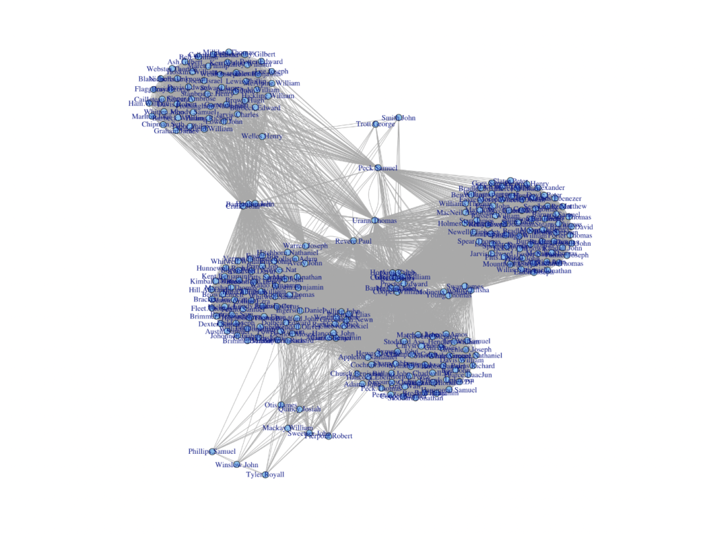
In this article, nodes are the most connected people. In the visual depiction above they are represented by blue circles. The person of interest for this particular article was Paul Revere but there were other nodes such as Thomas Urann, Edwards Proctor, and Nathaniel Barber. There were other nodes although these were the most prominent. In essence, nodes inside this article referred to the individuals with the most connections through edges in the social network. The edges were various organizations and groups that linked together the individuals (represented by grey lines above) . Simply put, the relationships between individuals were characterized by being in the same organization as another individual.
This project does not allow easy interaction if you are not used to working with data. There is no tool on the article that allows you to sift through the data as we have seen in previous articles we have read for this class. Despite this, it does link to the Github so we can see the whole list and you could manipulate it if you wanted to. If you wanted to you could throw the data in R (or something else if you desire) yourself and manipulate it how you wish. The article shows us the numbers and the output in a very digestible way and I do not think anything is lost by not being in a form for us to play around in.
Kieran Healy did a really good job of explaining how the project was created. Based on the tag of the article it appears it was done in R. I work with R a lot so I understand the manipulations he did to the data. Despite this, he did use some commands that I had not seen in a while so it was good to get a refresher. He goes step by step in a very easy to follow way on how he manipulated the data and created matrixes so he could get it into a table that he wanted. I found it really interesting so I put some of the code below.
> round(cent.bonpow[ind][1:10],2)
     Revere.Paul     Urann.Thomas    Warren.Joseph   Proctor.Edward
           -1.51            -1.44            -1.42            -1.40
Barber.Nathaniel     Hoffins.John   Cooper.William      Peck.Samuel
           -1.36            -1.36            -1.36            -1.33
     Davis.Caleb     Chase.Thomas
           -1.31            -1.31
I hope we read more material in this class that deals with using R code. I really enjoyed this article.