
The virtual Hereford Mappa Mundi is a digital project of the Hereford Cathedral which makes accessible the titular map, one of the largest extant medieval maps of the world. It is believed that the map was made around the year 1300, and contains geographic, religious, and other symbolic details. Because of this, the map provides wonderful insight into the worldviews and beliefs held by the educated medieval British.
The one source used by the creators of this project was the mappa mundi itself, located at the Hereford Cathedral in the United Kingdom. Their high-quality 2D and 3D scans of the map are on primary display here.
There are two major processes done by the creators that are presented here. First is the option to view a color-enhanced version of the map, undertaken in collaboration with the Folio Society. For this version, the inks and paints still present were chemically analyzed and an approximation of their original color at time of map creation is superimposed onto the map in an attempt to recreate what the map may have originally looked like. The second process undertaken by the creators is one of visual source analysis. They chose a selection of interesting details and symbols on the map to contextualize and analyze in the final presentation. The process of researching and choosing of only ~33 items to do so with on such a vibrant and detailed document must have required numerous choices of exclusion.
In presenting this information, the creators made the scans of the map the central attraction. When opening the site, they take up the majority of the space, and the eye is immediately drawn towards the fact that you can toggle between the original, color-corrected, and 3D textural scans. On the map are a variety of orange thumbprint symbols indicating points of interest. When clicking on these points, a text menu emerges from the left side with information on that point:
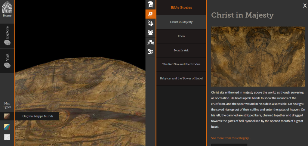
In my opinion, it’s a successful project. While there is not as much information given nor freedom to explore the map as I may have wanted, it seems more targeted to a general audience without much exposure to medieval documents. It is certainly accessible enough for anyone to enjoy and learn something from it. Still, I’m left wondering if there would be a way to increase the information presented, adding more detail and navigation tools, while still preserving accessibility. How does one balance these considerations in digital humanities projects?
I’m so impressed with how technology has come so far to create such detailed 3D scans. I didn’t know that this map existed or was so important to understanding medieval history, so being able to explore this map as such is really intriguing. Good work in breaking down this project, the process of how they digitized this map is very clear! And I agree, the question you pose at the end must be a crucial question within the field of digital humanities.
This is a really interesting project, and I never thought about the reinvention/exploration of older maps. The way they made the map 3d is really interesting because it gives the potential to add so much extra understanding to the maps we know, but I noticed that you said that one criticism you had was that there wasn’t as much freedom to explore the map as you would have wanted. I wonder if that is an issue that will be resolved soon, or if that is an issue that isn’t deemed “important” enough to resolve. I assume that with time though this will be perfected and become more interactive.
Great post! I think the question you pose at the end of your post is an excellent one — if the focus is on a curated selection of features on the map, and you aren’t even able to view the non-explained features freely, who exactly is the audience here? Students and general public that are taking their first look at the object, I guess? It just seems like a lot of the people who can’t make it to the Hereford Cathedral to see this thing might want to use it to explore their own, maybe less-thoroughly researched areas of interest.
I’ve heard of this map before but I’d never looked into this project. I think the digitization of maps in general has been crucial for all kinds of navigation, but I can only imagine what it was like to follow a map you only thought was accurate back in the 1300s. It’s interesting to see what sorts of places/objects/landmarks they considered significant enough to include, but that leads me to my question about the project. Why did they only include 33 notable locations? I’m not sure if the website answers this anywhere, or if it even provides rationale for the 33 choices it did make, but I’m just curious as to what kinds of other locations were left off the map and if there were any symbolic reasons for doing so.