In DGAH 110 this week, we launched our exploration into Digital Humanities projects by examining a range of online projects from various associations. Each of these had different objectives, implementations, and resources. We delved further into data visualization with regard to humanities work and tried to understand better how modern technology can produce outputs that are suitable for the field of humanities.
I recently stumbled upon The Rhythm of Food project with the suggestion of A.J. as I was in the ER instead of class. The Rhythm of Food project is a comprehensive data visualization of Google searches pertaining to food. This project, created by Google News Lab and Truth & Beauty, uses a combination heat-map/time of year graph in the form of a circle to present interesting statistical analyses of food items based on Google search results.
The Rhythm of Food team has compiled a data-gathering system, driven by a database, that is represented by the graphs above. The project’s used year-round Google searches, Google Knowledge graphs, and FooDB to predict. The objective of the project was not revealed on purpose. The project can act as a tool to help whatever your heart desires.
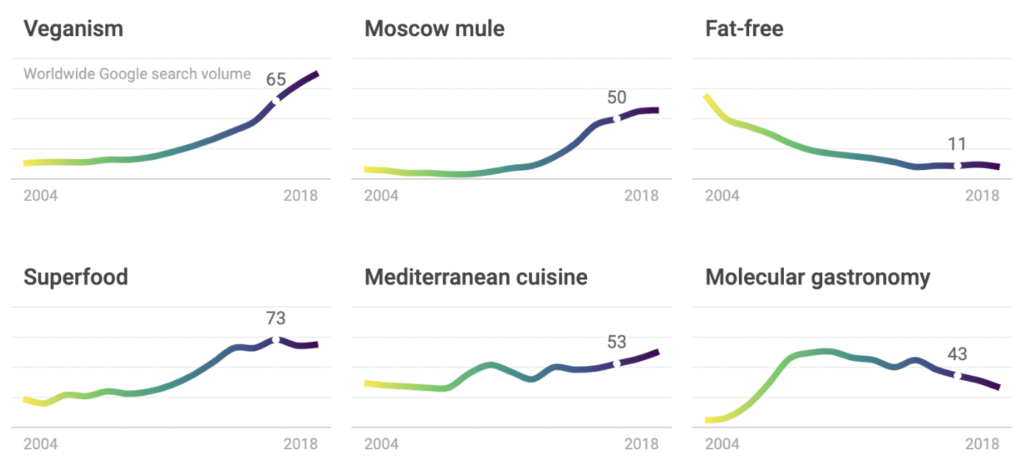
Looking at a screenshot from the homepage, I thought it was interesting that “veganism” and “superfood” have spiked over the course of time but “Fat-free” foods have fallen (using 2004-2018 data). Maybe this reflects increased nutritional knowledge among humans or rather fads. I wonder what the rest of the class thinks about this. Feel free to comment below!
Just so you know how the tools works better here is an example. Lets say one wanted to research a specific food, such as quinoa, the user could enter the term “quinoa” and sort by time of year to find when people are most concerned with their quinoa intake.
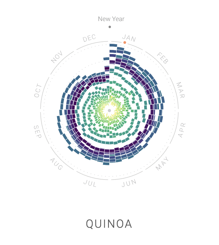
The results given show something that is very interesting. As someone who is a fan of New Year resolutions it quickly became clear why the term “quinoa” spiked in January. I also saw that A.J. notes this in his post but for the word ‘diet’. He also mentioned something that I did not immediately notice. This is that “diet” is at an all-time low during the holidays. Similar to this, quinoa being a notably “healthy food” had very similar results to diet with it peaking in January and all time low during the holidays. Despite me being a fan of New Year’s resolutions I believe I have only ever carried out one of them. That was to not eat dextrose for a year. This was a hard challenge as gatorade was my favorite drink. I was inspired by my friend’s mom as she told me it was the worst thing on the Earth for children to consume.
Lastly, I am intrigued by this project and am curious as to what level of accessibility you want for the source code and data. It doesn’t appear that this tool is being marketed, yet there is no code repository to view the code or access to the tools at the bottom of the page. I am curious why they chose to do this. The graphs remind me a lot fo the ones I had to make in Data Science last term. There are a lot of potential uses for this tool, let me know if you have a particularly good one below!