This week in DGAH 110, we began our investigation into Digital Humanities projects by taking a look at a number of online projects hosted by different organizations, all with different purposes, executions, and resources. The objective was to further explore the world of data visualization with respect to humanities work, and try to further grasp how modern technological fields can produce humanities-worthy material.
A project that caught my eye was the above project (linked in the caption); The Rhythm of Food, which was a comprehensive in-depth data visualization of Google searches pertaining to foods. Using a combination heat-map/time of year graph, portrayed as a circle, the Google News Lab and Truth & Beauty contractors provide viewers with a number of interesting statistical analyses of food items based on Google search results.
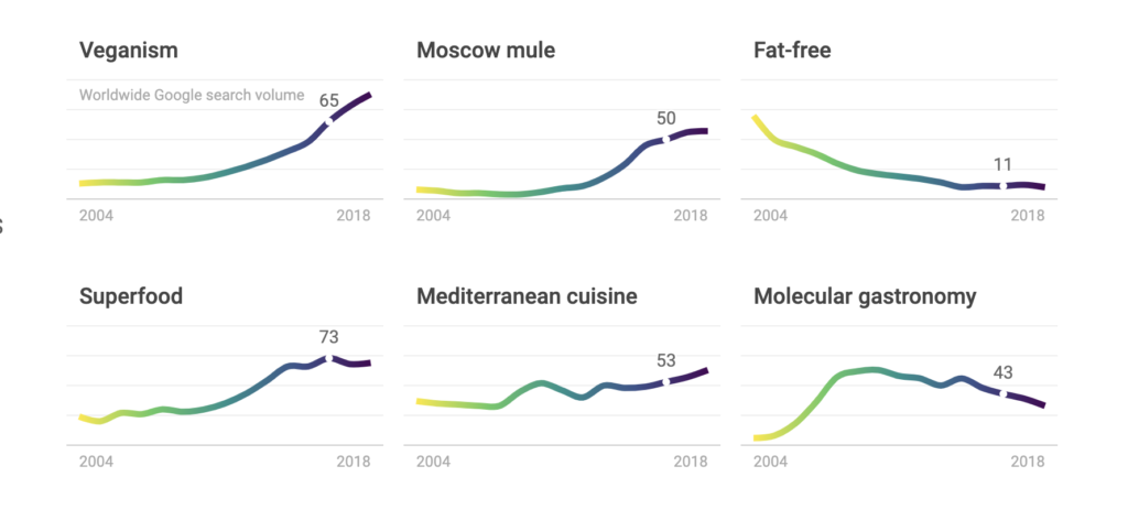
In addition to the described graphs (which I will provide an example of later) the above graphs stand at the top of the page, serving as a soft-introduction to the database-driven data-gathering of the Rhythm of Food team. The whole project is predicated on the results of year-round Google searches, across multiple years, with help from the Google Knowledge graphs and FooDB. The objective of the project is left intentionally open-ended, this isn’t a solution to a problem, it’s a tool whose only limit is the user’s imagination. For example, say you wanted to do research on diets, when are people most concerned with diets? This tool is an excellent place to start. You can enter the term “diet” and sort by time of year:
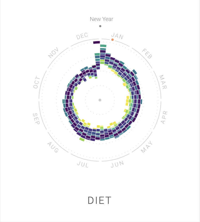
What we’re given as a result is one of the graphics I alluded to earlier, which tells a very interesting story. In January, the term “diet” spikes in search results, then gradually tapers off until hitting an all-time low during the holidays. Conclusion? I’m not the only one bad at keeping up with my New Year’s resolutions.
This was a pretty popular project we looked over in class on Thursday, so I’d be entirely unsurprised if any readers also took a detailed look at this project. This project does make me wonder, however, how accessible do you want your source code and data to be? It doesn’t seem like this tool is being marketed, yet I don’t see any code repositories to take a look at the code behind the scenes, nor direct access to the tools linked at the bottom of the project page. I can see many potential uses for this tool, but I’d love to hear what other people think!
—A.J.
I found this post very insightful. I even mentioned your analysis of diets in my post. I compared it to the use of the word ‘quinoa’. Your post looks perfect to me except there appears to be a quote of you first paragraph before the first image you use (Maybe that is just a stylistic option I was unaware of). I think it looks good otherwise and was very well written.