Using an Isotherms Map of the United States & Canada from the David Rumsey Map Collection, I have tried my best to rectify the map. This process involved placing down markers identifying corresponding locations between a classic global map and the Isotherm Map so that the latter can be warped to match the former as it is displayed. It was a very tedious project which become even harder due to how little landmarks the isotherms map has for me to match. As a result, I wasn’t able to warp it to my desired specification. This understanding of how difficult of a process it is has made me become very impressed with other georeferencing DH projects such as this one, since they were able to do what I cannot.
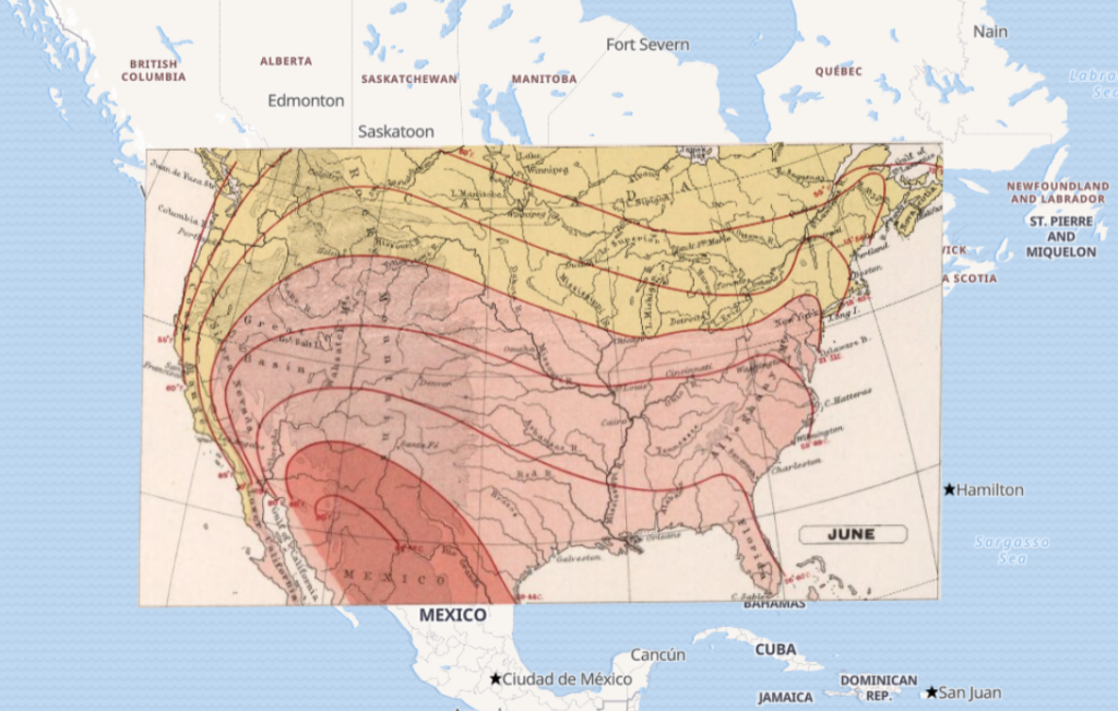
Through the “Overlay & compare” button here, it is possible to see the result of my effort using a few formats, including but not limited to “Overlay” and “Grid”, and share the URL link to the map itself. I believe a great improvement for georeferencing would be the ability to animate the product, such as using the isotherms map’s 12 seasons to create an animation displaying the movement of heat, allowing any viewers to have a much more intuitive understanding of the map.
Sadly, accuracy would always be a big issue for this kind of project, both due to the scale and the precision required. Even if one were to use already-created maps, the difference in cartography technology and the landscape itself will lead to difficulties in georeferencing with non-digital maps. On top of that, georeferencing would not be an appropriate method for certain fields of study. Ignoring the obvious examples like literature or mathematics, fields like economics can use georeferencing to obtain information on large scale trends but, at the end of the day, a closer analysis using transaction records and published accounts would net a much more detailed result.