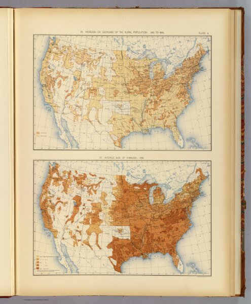
This week, we worked with the Georeferencer tool of the David Rumsey Map Collection, which allows volunteers to map points on maps in the collection onto a digital Mercator projection map of the world. I mapped a page from a book featuring two 1898 maps of the United States in 1890, presumably based on census data from that year. The top map of the two displays the population change in rural counties of the US between 1880 and 1890. If the population increased, the county is colored light orange. If the population decreased, the population is colored dark orange. The bottom map shows the average size of families in regions across the US in 1890.
When trying to georeference these maps, there were a few problems that I came across. First, I was unable to georeference both of them at once. Since both maps are of the United States, I could only effectively overlay one at a time, as you can see below:

I chose to match the top map, which makes the bottom map distorted when overlaying. This also brings up another problem: while I was able to match seven points and have all of the coastlines line up quite well, this was clearly accomplished by severely distorting the map. It seems likely that the book page used a different projection than the digital map I was overlaying on. I’m not sure if this would have messed up the interior of the country, making the county borders displayed less accurate.
The fact that I was often using coastal points as references also brings up another problem; how reliably can we georeference old maps with modern ones on a planet with changing sea levels and river paths? The answer is likely to use cities as reference points, but they are not always accurately mapped nor present at all.
At the same time, if cities are mapped, using them as reference points offers a very interesting way to measure sea level, river course, and other environmental changes, if we believe their charting on the older map to be accurate. In that way, I suppose the depictions of waterways are both a curse and an interesting research question for Digital Humanities mapping projects.