For this visualization, I chose to use Rawgraphs.io to produce a line graph about the top 10 baby names in New Zealand from 2001-2010. The image of the line graph can be seen below.
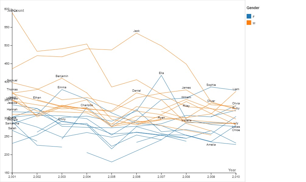
I chose to implement a line graph, because line graphs are great in showing trends across time. For line graphs, the year is on the x-axis, while some numerical variable is on the y-axis, being the count of each name in this case. While this site allowed for multiple different types of graphs, with some being more flashy and unique, not many of the graphs were suitable for showing data across time. I also believe that line graphs are simple to understand, and I prefer to have graphs be as easily interpretable as possible, even if this sacrifices its presentation. Additionally, line graphs are appropriate because each line can represent a different name, and the lines can be color coded based on some variable, such as by sex in this case.
In order to not sacrifice any clarity in the graph, I didn’t have to change much to this line graph. However, I did make a couple small changes. One change was adding the legend, which shows the color associated with each baby name. I also changed the lines from being curvy to straight lines. I made this switch because although the curvy lines are more visually appealing, we don’t know how baby names changed throughout a specific year, so I felt that the curvy lines gave the false impression that we had continuous data on how the popularity of each name changed throughout time. The linear lines show that the data gathered was discrete, and more clearly shows the count of each name for each year in my opinion.
From Lin’s lesson, it’s clear that digital humanities places a large emphasis on telling a story through data. In order to do so, the data must be presented in a clear way so the reader can parse the story that is being told. Therefore, I feel as if my visualization relates to digital humanities in particular is that I chose to make my graph as understandable as possible. That way, as long as the reader has a clear understanding of the graph, they are able to understand what is being told through the data.
I agree that many of the graphs available were not suitable, the data given did not allow for a wide variety of vizualizations. I also opted to show the frequency of each name over time but with a multi-set bar chart. I also think it was a really good idea to add a legend.
I also made line graphs due to the same reason. However, I find the clutter of the lines and the labeling system a little hard to follow, but I can still get an idea of the story you are trying to portray. I thought your reasoning for connecting observations with straight lines instead of curved lines was smart. Good Job!