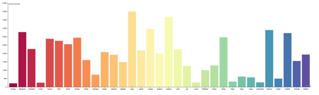
For this lab, I chose to use the Rawgraphs.io data visualization website to create a comparison between names based on popularity, or more specifically, the amount of “counts” each name had in the data set. I chose to use a bar chart because that way I could set individual bars to each name and see which of the names appeared the most throughout the decade. I tried using other graphs such as a line chart but there ended up being too much going on between the mass amount of intersecting lines, name labels, and the lack of color options. With a bar chart, there is a clear distinction between each category and the counts can easily be determined by viewers, referencing one of the key ideas Lin gave on her lecture on data presentation regarding clean presentation of data. Some changes that I made to improve clarity in the representation were making the graph much wider for better physical separation of variables, increasing padding to make the bars more distinct and spaced, and changing the color scheme so that the differences in counts between each category could be seen better.
The digital humanities places on large emphasis on representing data in a way that allows for a variety of people to have access to it. The whole point of data visualizations is to present data in a more understandable and interactive manner so that the general population can learn and potentially make their own projects about the data to share with the world. With my visualization I aimed to do just that, albeit a smaller scale, and provided a more digestible interpretation and comparison of variables from a larger data set.
This is a very clean looking plot! The different colors really adds to making it a visually appealing plot, and bar plots are already widely understood given how often they’re used. The only issue I can think of is that baby name counts outside of the top 10 for a given year aren’t represented (such as if Jack was in the top 10 one year but not the next), but that isn’t an issue with the look of the bar plot and more with the data we had on hand. Nice job!