This week, we were given a table of data and tasked with visualizing it: the 10 most popular male and female baby names in New Zealand between the years 2001 and 2010. Being merely a list, the data itself is rather underwhelming, but I played around with it on rawgraphs.io for a while and found that while I didn’t understand a lot of what I was doing, it was still really cool to see this sheet of simple data come to life in so many different ways. Here is the final visualization I decided to create and share with you all.
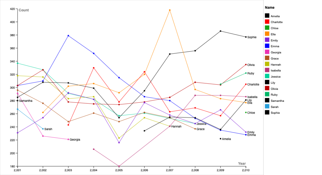
I used Excel to alter my data, removing all the male names and choosing to graph only the female ones. After copying it to rawgraphs, I spent a bunch of time trying out the different visualization options and seeing how easy they were to understand and manipulate. I ended up having a lot of trouble with some of the tools which I won’t go into much detail on, but I ended up deciding to use a simple line chart — a graph that displays a quantitative dimension over a continuous interval or time period. I set my x-axis as the “Year” dimension (a numerical variable) and y-axis as the “Count” dimension (also a # variable). I added the “name” dimension to both the chart’s lines and colors, left the “series” variable blank, and rawgraphs spat out a line chart that looked very similar to the one above. Using the Customize tools on the left, I changed the size of my artboard so names didn’t get cut off on the margins, I added a legend because why not, I added dots to my chart at each data value and increased their diameter slightly, I made the graph linear instead of the “bump” type, and I changed the color for each name to make each corresponding line and dot more discernible from its neighbors.
I had originally wanted to try using a Beeswarm Plot to show the data in a certain way, but ran into some issues with the scale of each bubble. This problem was consistent across pretty much all visualizations I tried that had bubbles representing quantities and proportions. I was unable to alter the scale of the charts, much like I wasn’t able to remove the “,” (comma) from all of the year values, and that meant that the bubbles were always a lot smaller than I wanted them to be in relation to the area of the chart. It wasn’t until I’d tried out all the cool visualizations I wanted to work with that I realized a line chart might be the best way to visualize my chosen portion of data. The chart shows the trends among the most popular female baby names in NZ in each year from 2001-2010. Each data point on the x-axis (each year) almost serves as a column when you look down the stacked dots. I think it’s also pretty cool how some lines begin and end at random points on the chart, indicating their oscillation in-and-out of the top 10, but how every year still only has 10 dots because that’s all the data gives.
I like how much Lin talked about style, and how the style of your presentation can either make it easier for people to understand your data and the trends being shown, or much harder than it should be. When Lin discussed the concept of a “visual hierarchy,” I felt like I was hearing a new approach to something I knew well already — in short, how to make certain aspects of something stand out more to change/control the viewer’s point of focus. I feel like it’s even similar to photo and video editing with the manipulation of contrast; you create differentiation between the shadows and highlights and blacks and whites in the hopes of creating a deeper and more visually enticing image. I think my chart of choice, and the alterations I made to improve the visualization, also relate to DH in particular because of our ability to take something so simple and ordinary, something understandable yet bare, and visualize it in a decorative and organized manner. Digital humanists are able to create trends, relationships, correlations, and all sorts of visual cues that affect our understanding of a dataset.
I really like your graph due to its clearness and effectiveness to showcase data trends, and honestly it is one of the best I’ve seen from this class. Your choice of a line chart and only visualizing half the names are also great ideas, which made your work very readable and allows me to analyze the trend by myself.
I think the line graph you used is very effective in terms of showing the trends over time. Also, removing all male names makes your graph clear as it wouldn’t be as packed if you used the original data. One suggestion is that you can make two separate graphs for male and female names so that all data are presented, and I think you can do so in raw graph.io
I think the line graph you used is very effective in terms of showing the trends over time. Also, removing all male names makes your graph clear as it wouldn’t be as packed if you used the original data. One suggestion is that you can make two separate graphs for male and female names so that all data are presented, and I think you can do so in rawgraphs.io by simply selecting the series to be gender.